
Role:
UX/UI Designer
What is this project?
Redesigning the way individual Nameplates were being presented on Brand pages for Range Rover, Defender and Discovery.

SCROLL
Masonry Media Component
The Problem + Solution
I created a visual mosaic with clear CTAs.
Oversized images made copy + CTAs unclear.
Soft, phased loading guided user focus.
Key info was lost in the visual clutter.
Designs felt more premium and user-friendly.
Vehicles weren’t introduced effectively.
Control
Solution

The layout of images and video creates a more immersive introduction to the vehicle, giving users richer context and a clearer narrative.

The design maintains visual clarity and hierarchy across breakpoints, ensuring consistency and usability on mobile, tablet, and desktop.
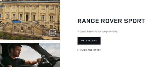
Copy and CTAs are now placed with intent, clearly linked to imagery, making navigation and decision-making easier for users.
Key Shots
Impact + Results
Desktop
Mobile
Boosted brand clarity and engagement by aligning CTAs and copy directly with corresponding imagery and video, offering users a more immersive brand experience.
Established a refined, luxury aesthetic that stood out from competitors while staying functional.
Created a reusable component now being utilised across various areas of the JLR websites.